Origins of Bento grid design
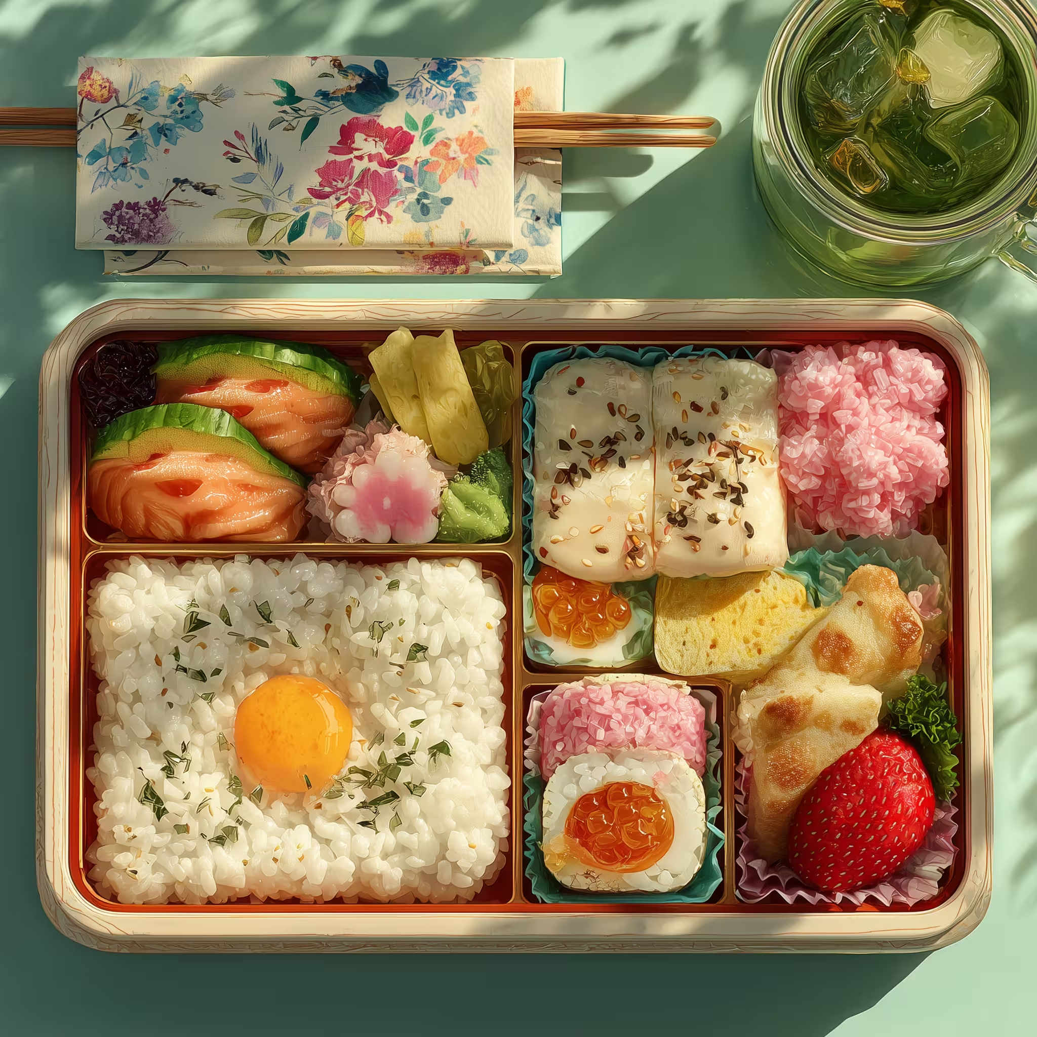
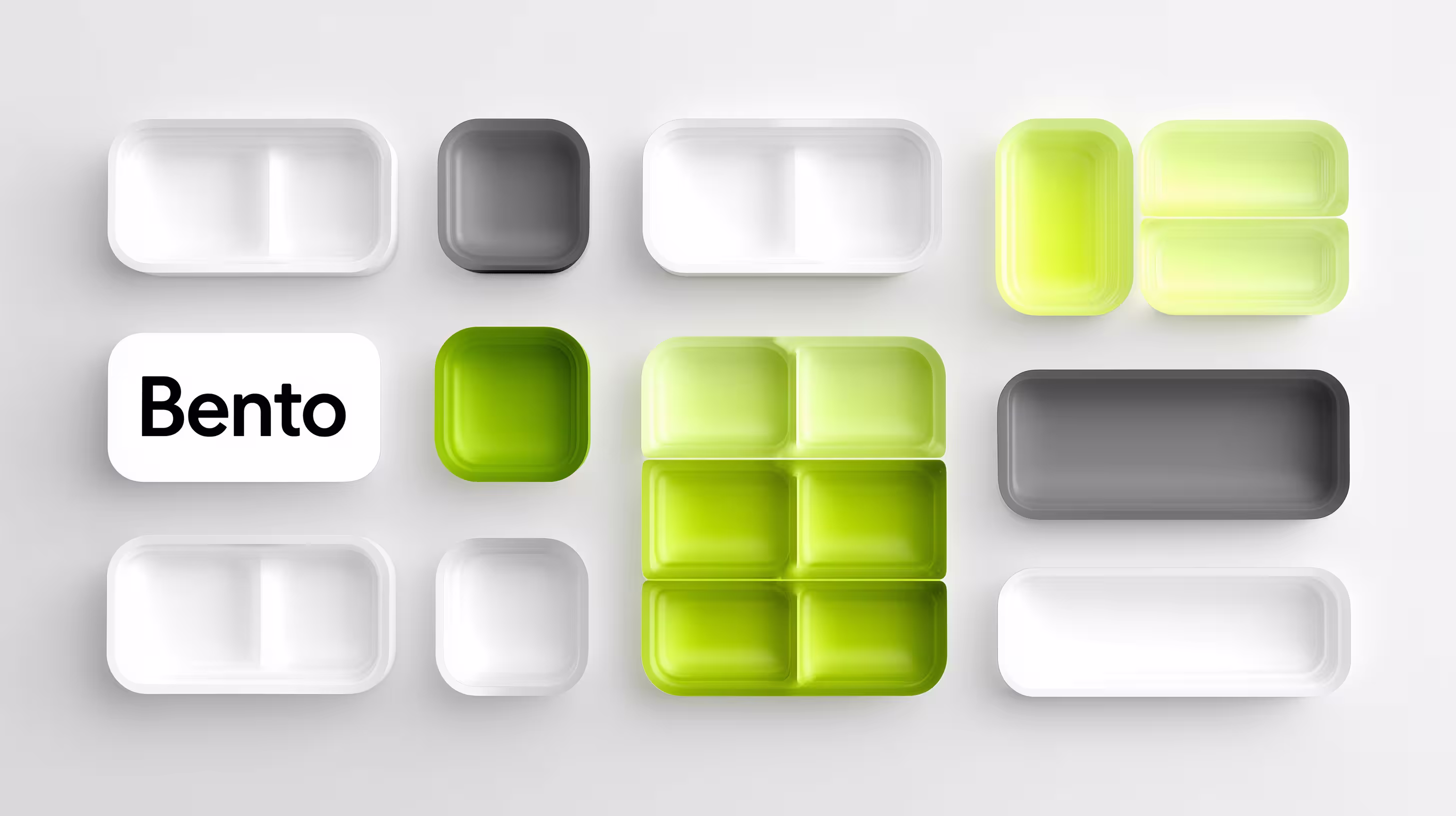
The concept of Bento grid design draws its inspiration from Bento boxes, which are compartmentalized lunch boxes used in Japanese cuisine to separate and organize different types of food. Just as a Bento box neatly arranges food into individual compartments, a Bento UI organizes content into distinct, visually appealing sections. This layout style emphasizes order, simplicity, and balance, making it a perfect fit for modern digital interfaces.
In UX/UI
While the Bento box layout isn’t entirely new, its application in web design has gained traction in recent years as designers seek ways to create clean, structured, and engaging user experiences. The bento box design is celebrated for its aesthetic versatility and ability to present content in a visually engaging manner. This trend aligns with the broader movement towards minimalism in design, where content is prioritized, and every element serves a clear purpose. The influence of Microsoft's Windows Phone and its Metro design language on the bento box style has also been significant, contributing to a creative shift in design practices.
Benefits of bento grid design in UI/UX
Adopting a Bento grid layout offers several advantages that can significantly enhance both the aesthetics and functionality of digital products:

Enhanced visual appeal
The Bento grid’s clean lines and balanced structure create a visually pleasing interface. By breaking down content into manageable, distinct sections known as content blocks, designers can guide users’ attention and improve the overall user experience.
Improved usability
Bento grid design simplifies navigation by organizing content into clearly defined areas. Users can easily scan and locate information, making the interface more intuitive and accessible.
Responsive design
Bento grid layouts naturally lend themselves to responsive design. The grid structure can easily adapt to various screen sizes, from desktop monitors to mobile devices, ensuring a consistent and user-friendly experience across platforms. The use of CSS Grid in creating these layouts allows for flexible and harmonious arrangements of diverse content types.
Content prioritization
The Bento box layout allows designers to highlight important content by giving it more space or a prominent position within the grid. This makes it easier to guide users through the most critical aspects of a page or app.
Flexibility and scalability
Bento grid design is versatile and can be customized to fit various types of content and projects. Whether it’s a portfolio, e-commerce site, or corporate webpage, the grid can be adjusted to meet specific needs without compromising on style or usability.
Best practices for implementing Bento grid designs
Even the most structured layouts, like Bento grids, have their DOs and DON'Ts. To make the most of this trend, it's important to focus on best practices: start with a clear content hierarchy to prioritize what matters most, use spacing wisely to keep the design clean and readable, incorporate imagery and color strategically for visual interest, maintain consistency across all elements to create a cohesive look, and always test and iterate to refine the user experience. By following these guidelines, you can ensure that your Bento grid layout is both functional and visually appealing.
Start with content hierarchy
Before diving into design, map out your content hierarchy. Identify the most important elements that need to stand out and determine how they should be arranged within the grid. This will help you create a layout that is both functional and visually appealing. Additionally, using a grid system for organizing content can further enhance the structure and flow of your design.
Use spacing wisely
One of the key features of Bento grid web design is its use of space. Proper spacing between grid items not only enhances readability but also ensures that the layout doesn’t feel cluttered. Use padding and margins to create breathing room around elements. Implementing a bento-style layout is crucial for maintaining a clean and organized appearance, leveraging properties like grid-template-areas for flexibility and responsiveness.
Incorporate imagery and color
To keep the design engaging, use imagery and color strategically. Images can be used as focal points within the grid, while color can help differentiate sections and guide the user’s eye through the interface.
Maintain consistency
Consistency is crucial in Bento grid design. Stick to a cohesive style for all grid items, including fonts, colors, and spacing. This helps create a unified look and feel across the entire interface.
Test and iterate
As with any design approach, testing is essential. Gather feedback from users and make adjustments as needed. Pay attention to how users interact with the grid and make sure it aligns with their expectations and needs.
Successful implementations of bento grid design
Several brands and websites have successfully implemented Bento grid designs, demonstrating the versatility and appeal of this layout style. For example:
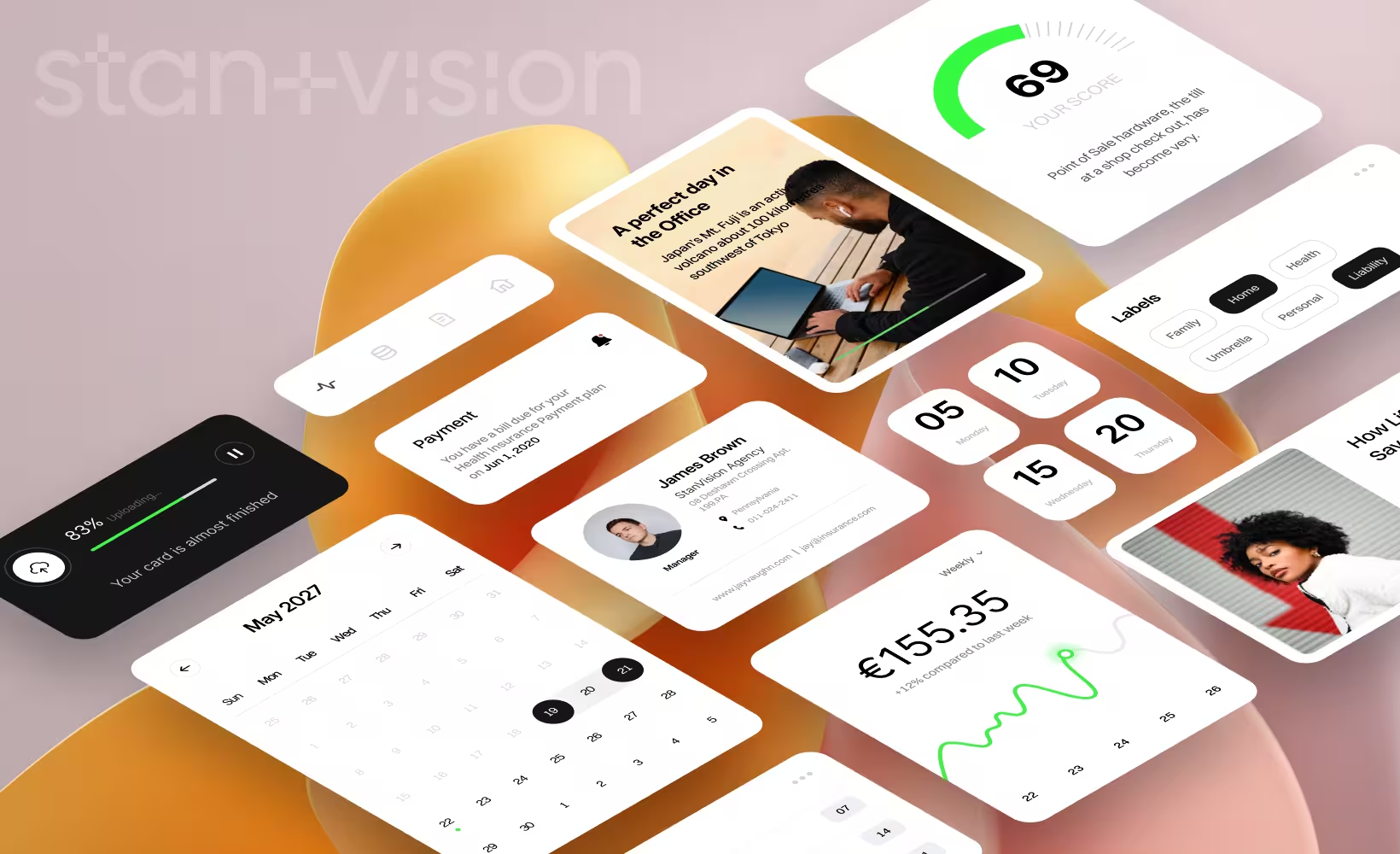
- Apple’s product pages: Apple often uses Bento grid layouts to showcase its products. This approach is part of the emerging bento grid trend, which draws inspiration from Japanese bento boxes and is known for creating visually appealing and organized layouts. Each product or feature is given its own section within the grid, making it easy for users to explore different options without feeling overwhelmed. The landing page design effectively showcases key features, guiding the user’s attention with engaging visual treatments and structured layout.
- Pinterest: Pinterest’s design is a prime example of Bento grid web design in action. The platform organizes pins into a grid format, allowing users to easily browse and discover content based on their interests.
- Notion: Notion’s customizable dashboards often utilize Bento grid principles, allowing users to arrange blocks of content (text, images, databases) in a way that suits their personal workflow, further enhancing usability and personalization.
Tips for designers adopting bento grid design
For designers looking to adopt Bento grid design in their projects, here are some additional tips:
Experiment with asymmetry
While Bento grids are typically balanced, don’t shy away from experimenting with asymmetrical layouts. This can add a dynamic and modern touch to your design, making it more visually interesting.
Incorporate bento box style
The bento box style is an innovative design approach that uses a grid layout to present content in visually appealing blocks of varying sizes. This style's minimalist aesthetics allow you to effectively communicate information without overwhelming the viewer, making it ideal for creating dynamic layouts.
Keep accessibility in mind
Ensure that your grid layout is accessible to all users. This includes using sufficient contrast between text and background, ensuring that interactive elements are easily tappable, and providing alternative text for images.
Leverage design tools
Modern design tools like Figma and Sketch offer features that can help you create and iterate on Bento grid layouts quickly. Utilize grid systems, component libraries, and templates to streamline your design process.
Stay updated on UI trends 2024
The digital design landscape is constantly evolving. Keep an eye on emerging trends and technologies that can complement your Bento grid designs, such as micro-interactions, 3D elements, or AI-driven personalization.
To sum up
As we’ve explored, the Bento grid design is serving up a perfect blend of style, functionality, and user satisfaction—much like its culinary counterpart does with sushi, rice, and a touch of wasabi. Whether you’re a seasoned UI/UX chef or just learning to cook up some digital magic, the Bento grid layout is your secret ingredient to a well-organized, visually delightful interface.
So, why not take a page from the Japanese lunchbox playbook? After all, with Bento grids, you’ll have your content looking so good, that even your users will be saying, "Sayonara, cluttered layouts!"
Ready to bento-fy your next design? Just remember: less mess, more success!