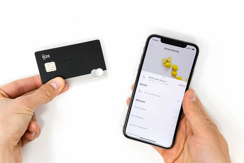
The physical boundaries of banking no longer stand a chance against the Internet as the way we interact with our financial affairs has changed dramatically. The dawn of mobile banking apps has shown us the future of banking - a future where financial transactions are no longer restricted to the institution of the bank but are at our fingertips, just a few clicks away.
UI design has a key position in obtaining the trust of customers. A well-designed banking UI not only appeals visually but also shapes the user experience in a way that simplifies banking processes and makes them intuitive and efficient. We'll be sharing some of our best practices for creating UI for a mobile banking app.

Designing a successful banking app UI at Stan Vision is a fusion of artistic finesse and scientific precision. User feedback is not just data; it's the motivation for continuous improvement, ensuring our UI resonates with user needs and propels us toward ongoing innovation. Accessibility and inclusivity are not checkboxes; they are fundamental values that shape a banking experience that's not just comprehensive but inclusive for all.
The importance of UI design in mobile banking apps
In the realm of digital banking, UI design goes beyond mere aesthetics. It serves as the integral link between user experience and competitive advantage. When users interact with a banking app, our design plays an integral role in determining how seamless these transactions feel.
The goal is to not only meet but exceed user expectations with just a few clicks on their mobile app. The physical boundaries of banking no longer stand a chance against the Internet. The way we interact with our financial affairs has changed dramatically. The dawn of mobile banking apps has shown us the future of banking - a future where financial transactions are no longer restricted to the institution of the bank but are at our fingertips, just a few clicks away.
Banking app UI holds a key position in obtaining the trust of customers. A well-designed banking UI not only appeals visually but also shapes the user experience in a way that simplifies banking processes and makes them intuitive and efficient.
Our experience with digital banking design has proved to us that UI design goes beyond aesthetics. It serves as the integral link between user experience and competitive advantage. When users interact with a banking app, the design plays an integral role in determining how seamless these transactions feel.
The goal is to not only meet but exceed user expectations with just a few clicks on their mobile app. In this article, we'll be sharing some of our best practices for creating UI for a mobile banking app.
Financial institutions have started to notice the negative effects of below-average app design. Increasing competition from challenger banks and the need to maintain customer satisfaction have forced them to innovate and evolve their UI/UX design. It’s no longer enough to offer financial products; banks must deliver these services through an intuitive, user-friendly platform that ensures a positive user experience. This is where we, as design professionals step in. Let's dive into our experience-based approach to mobile banking app design.

User-centric approach
Adopting a user-centric approach in banking app design has become a necessity rather than a mere trend. It focuses on aligning the app with the needs and preferences of its target users. The goal is to create a banking experience that feels tailor-made for each user, resulting in heightened user satisfaction and loyalty.
Adopting a user-centric approach in banking app design brings a multitude of benefits. This approach leads to higher user adoption rates due to the improved intuitiveness of the app. It also allows for a level of customization that aligns with user needs, preferences, and expectations, making the app feel more personalized. With this approach, users can have instant access to crucial features, enhancing their overall experience.
Moreover, a user-centric approach aids in the identification and resolution of issues during the testing phase. This proactive problem-solving can save resources and time, and prevent user dissatisfaction. By prioritizing the user's needs, the design process becomes more effective and efficient.
When financial service products are designed with the best interests of the user in mind, they are more likely to maintain usage and advocate for it, leading to heightened customer loyalty.
Competition and innovation
Within the fast-paced digital banking sector, simply staying on par with competitors doesn’t suffice. Innovative, user-friendly UI design is key to standing out, attracting, and retaining customers. One such innovation is the use of gamification, aimed at maintaining user engagement with the app beyond the transfer of money.
Take the example of Monese, which allows users to accumulate Avios points by using their Monese cards for purchases from Avios partner brands. This clever integration of gamification into their banking app user interface promotes user engagement beyond basic banking tasks, such as transferring money and sending money.
Another successful strategy is the use of personalized promotions in mobile banking apps, which can significantly increase user engagement and loyalty by providing a more tailored experience. This can be seen in the form of location-based push notifications about local ATMs or offering loans when detecting child expenditures. By utilizing such notifications, mobile banking apps can enhance their overall user experience.
It’s about providing the right service at the right time and creating a personalized banking experience that keeps users coming back.
Essential components of an effective banking app UI
Developing an efficient banking app UI resembles piecing together a jigsaw puzzle. Each piece, or in this case, each component, plays a crucial role in the overall picture. The essential components of an effective banking app include:
- Clarity
- Simplicity
- Consistency
- Familiarity
However, achieving these requires a deep understanding of the user’s needs and expectations.

Take the example of Lloyds Banking Group’s app, which uses visible and swipeable account cards. This design prioritizes clarity and simplicity, allowing users to quickly view their account balances upon login and efficiently swipe to access other accounts without the need for vertical scrolling.
Another essential component is the display of account balances, including credit accounts, on the landing screen. This provides users with the ability to efficiently manage their finances and avoid potential overdrafts, thereby contributing to an enhanced overall user experience.
Clarity and simplicity
Clarity and simplicity frequently stand out as key principles of successful UI design. These principles ensure that users can easily navigate and understand the app, leading to a better user experience. Clarity and simplicity are the cornerstones of successful UI design. They play a crucial role in reducing information overload and creating an intuitive and easily navigable interface. This allows users to find information quickly, complete tasks with just a few clicks, and understand the purpose and functionality of each element.
These principles also help to avoid user confusion and frustration. By incorporating clarity and simplicity into the UI design, users can navigate the app with ease and efficiency. This leads to a better user experience, as users can quickly access the information they need and complete their tasks without any unnecessary complications.
In the end, a clear and simple UI design not only enhances the user experience but also promotes user satisfaction. It ensures that users can easily understand the app's functionalities, leading to a more enjoyable and efficient user experience.
By incorporating clarity and simplicity into your UI design, you can create a seamless and enjoyable user experience.
For example, a banking app that uses clear and simple language prioritizes security, and provides clear feedback is more likely to resonate with a wide range of users. Furthermore, designing forms with simplicity and maintaining consistency in visual elements and features fosters an intuitive design that users can navigate easily, regardless of their tech savvy.
Consistency and familiarity
Maintaining consistency and familiarity in UI design is key to fostering a user-friendly experience. They help users feel comfortable and confident while using the app, reducing the learning curve and increasing user satisfaction. This can be achieved by maintaining consistency in graphic elements, features, and overall design.
To illustrate, let’s consider the banking app’s navigation. If the navigation bar is at the top of the screen on one page and at the bottom of the screen on another, it could confuse the user and disrupt the flow. Consistent placement of UI elements can save users from unnecessary cognitive load, allowing them to apply their knowledge across different areas within the app.
UI patterns for banking app design
Like all creative industries, building an effective banking app UI involves gaining insights from successful models and tailoring them to meet specific needs. Some of the top UI patterns and inspirations for banking app design include minimalist and modern aesthetics, as well as personalization and customization.
The motivation behind utilizing a straightforward UI pattern is to simplify intricate financial data. It aims to provide non-financial experts with a clear and quick understanding of their finances while minimizing the learning curve.

Minimalist and modern aesthetics
Banking app UI design, especially in the realm of mobile banking app design, has seen a rise in the popularity of minimalist and modern aesthetics. They contribute to a clean and visually appealing interface, making it easier for users to navigate and interact with the app.
An app with minimalist and modern aesthetics not only looks appealing but also reduces visual distractions, making it easier for users to focus on the tasks at hand. Banking app UI design is an intricate process that involves a lot more than just creating a visually appealing interface. It's about designing an experience that is both attractive and user-friendly. This is a crucial aspect of the design process as it directly impacts the user's interaction with the app and their overall satisfaction.
One of the key components in achieving this is the incorporation of sleek lines in the design. Sleek lines contribute to the overall clean and modern aesthetic of the app, making it visually appealing to the user.
Another important element is the use of minimalistic layouts. These layouts are not cluttered and provide a clear and straightforward user interface. This simplicity makes it easier for users to navigate through the app and perform their banking tasks efficiently.
The choice of color combinations also plays a significant role in the design process. Pleasing color combinations are easy on the eyes and enhance the visual appeal of the app. They also help in creating a positive user experience by making the interface more inviting.
Strong typography and animations add to the overall aesthetics of the app. Strong typography ensures readability and clarity, while understated animations make the interface more interactive and engaging. Together, these features establish a welcoming and attractive aesthetic that users appreciate and enjoy.
Apps like Revolut are great illustrations of effective UI design. They achieve this through the use of polished visuals that are pleasing to the eye. They make efficient use of space, which helps to reduce clutter and improve readability. The icons used are uncomplicated, making them easy to understand at a glance. Finally, the cohesive color palettes used throughout the app create a visually pleasing and consistent user experience.
Personalization and customization
The ability to personalize and customize is revolutionizing our interactions with banking apps. They allow users to tailor the app to their preferences, enhancing the overall user experience. Incorporating personalization and customization in mobile banking apps brings several benefits. It fosters increased user engagement, promotes app usage, and delivers a more personalized and relevant banking experience.
It also plays a pivotal role in the success of a mobile banking app by improving the user experience and fostering greater customer loyalty. By segmenting users, selecting appropriate customization levels, and adjusting the app to accommodate users’ distinct preferences or attributes, designers can create a banking app that feels tailor-made for each user.
Future trends in digital banking
As we venture into the future of banking app UI design, we discover groundbreaking features that elevate the user experience to unprecedented heights. Two such features that are making waves in the industry are biometric authentication and voice-activated banking.
Biometric authentication offers a secure and convenient way for users to access their accounts, thereby greatly enhancing the user experience. On the other hand, voice-activated banking, driven by AI, enables users to interact with banking services using voice commands. This not only makes banking tasks more convenient but also provides a seamless, hands-free banking experience.
Biometric authentication
Biometric authentication has surfaced as a potent instrument in the domain of banking app UI design. It provides a secure and convenient way for users to access their accounts, thereby significantly improving user experience and trust.
This technology uses unique physical or behavioral characteristics, such as facial recognition or fingerprint readers, to confirm a user’s identity. By introducing an additional layer of security, biometric authentication inherently increases the app’s level of security compared to passwords, PINs, and cards. Furthermore, it contributes to bolstering the trust and confidence of customers when they transfer money.

Voice-activated banking
Thanks to the emergence of AI, voice-activated banking has transitioned from concept to reality. It allows users to perform banking tasks using voice commands, offering a more seamless and hands-free banking experience. This innovative feature is a game-changer in the field of banking app UI design, pushing the boundaries of what we thought was possible.
Voice-activated banking operates by utilizing voice commands to execute particular financial transactions. It enables users to swiftly and accurately provide information, detect emphasis and allows users to multitask. This feature is a testament to the power of modern technology, leveraging advancements in AI and natural language processing to understand and act upon user commands.
Natural language enhances the user experience by delivering expedited and automated services, simplifying banking activities, and facilitating rapid, secure, and convenient payments. By automating these tasks, it reduces the burden on the user, making banking an effortless experience. This hands-free approach to banking offers a level of convenience that was previously unimaginable, allowing users to perform banking tasks while on the move, cooking dinner, or even working out.
In addition, voice-activated banking also contributes to enhancing accessibility. For users with physical impairments that limit their ability to use traditional input methods, voice commands offer a viable and inclusive alternative. This ensures that banking apps are accessible to a wider range of users, promoting inclusivity and equality.
Looking forward, as voice recognition technology continues to improve and become more widespread, we can expect to see even more innovative uses of this feature in banking app UI design. The future of banking is voice-activated, and it's an exciting time to be a part of this revolution.
Best practices for designing and testing a bobile banking app
The creation of a successful banking app UI is a blend of artistic flair and scientific precision. It involves understanding the user’s needs, iterating on the design based on user feedback, and ensuring that the app is accessible and inclusive for all users.
User feedback holds considerable importance in the cyclical design process of a banking app’s UI. Regular collection and analysis of user feedback ensure that the UI aligns with user needs and fosters ongoing innovation.
At the same time, accessibility in banking app UI design is crucial as it guarantees the usability of the app for all users, including those with disabilities. It improves user experience, and functionality, and fosters inclusivity and independence.
User feedback and iteration
Engaging with the users directly is one of the most potent strategies for designing a user-friendly banking app UI. Gathering user feedback and iterating on the design helps ensure that the banking app UI meets the needs and preferences of its users, leading to a better user experience.
Accessibility and inclusivity
Any UI design process should prioritize inclusivity and accessibility. Ensuring these elements in banking app UI design allows a wider range of users to enjoy the app, promoting a more diverse and inclusive user base.

When it comes to inclusivity in mobile banking app UI designs, there are several key features and practices to consider. The utilization of clear layouts helps users quickly understand the app's structure. Standard navigation icons provide familiarity and ease of use. High-contrast color combinations enhance readability, especially for those with visual impairments. Content should be screen reader-friendly to cater to visually impaired users. Lastly, using simple and accessible language ensures the app's content is comprehensible to a broad range of users, thereby promoting inclusivity.
By prioritizing essential content on the home screen, banking apps can ensure that their services are accessible to all users, irrespective of any impairment or background.
FAQ
What is the difference between a banking app and mobile banking?
The main difference is in their functionality - online banking offers a broader range of services through a computer and Internet, while mobile banking is accessible through a mobile device and can be used with or without Internet. Both provide essential banking transactions such as checking balances and transferring funds.
What is design in banking?
In banking, design involves understanding the user, defining problems, generating ideas, prototyping, testing, and iterating to create a user-centric experience.
What are the key aspects of UI design in mobile banking apps?
The key aspects of UI design in mobile banking apps encompass a user-centric approach, simplicity, clarity, consistency, familiarity, and innovative features such as biometric authentication and voice-activated banking. Emphasizing these elements can enhance the user experience and overall usability.


